
Responsive web design is the big thing at the moment. No longer do you have to have a separate mobile website that’s tailored to smaller screen sizes. You can program your website to monitor the screen size it’s being displayed on and adjust the layout to suit.
This website is fully responsive. Give it a go by dragging one of the sides of your browser window to make it narrower. As you do you’ll see the right hand column jumps down below this main column, the top menu resizes itself then changes to a mobile friendly drop down, etc. This is all to make sure that people using a tablet or smartphone can see and use the site correctly.
But as the screen gets narrower some objects need to be resized to fit onto the page. This resizing sometimes requires them to be resized proportionally, i.e. the width and height need to change so as not to stretch the object.
Images can do this automatically. As long as you don’t specify a height for the image, controlling its width will automatically resize it correctly.
Not So Easy For Video
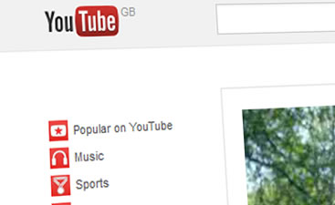
But other objects can’t do this. Controlling the width of a <div> or <iframe> element will only alter one dimension. The height will stay the same so the object will get squashed. One of the objects that ends up getting distorted is an embedded YouTube video player.
How The YouTube Player Works
When you get the embed code (the html YouTube gives you to paste onto your web page) you’ll see it looks something like this.
<iframe width="560" height="315" src="http://www.youtube.com/embed/Ke1Y3P9D0Bc" frameborder="0" allowfullscreen></iframe>
It’s using an iframe object to hold the player on your page. When the player loads it is programmed to fill the iframe its placed inside.
So we need to be able to control the size of the iframe to control the size of the player.
Proportional Sizing In A Responsive Layout
There’s a neat CSS trick we can use to get the desired effect. Basically we need a way of linking the height of an object to its width. Surprisingly we can do this using the CSS padding attribute.
Setting an absolute (pixel) value for padding doesn’t help. But if we use a percentage size it will always be a percentage of the object’s width. That’s right! Even the top and bottom padding is controlled by the object width. To use this we can create a holder object that has a responsive width, and a proportional height. We then place our target object inside this holder and make it fill the space.
Now as the page narrows your object width will reduce according to your normal responsive CSS rules. For example if you’ve set its width to 50% it will always cover half the available area.
As this width narrows your object’s height will also alter proportionally. For example if you’ve set the height to 33% the object will always keep its 3:1 aspect ratio.
Some Real, Responsive Code For Our Embedded YouTube Video
First we need to build the holder object that’s going to create the responsive area. We’ll use a div with its position set to ‘relative’ so we can then place our ‘real’ objects inside it. We’ll then set its width to our responsive design width. To make its height proportional we use padding and set the height value to zero.
HTML Code
<div class="youTubeHolderArea">
<iframe src="http://www.youtube.com/embed/qwertyuiop" width="100%" height="100%"></iframe>
</div>
Note that I’ve set the iframe height and width to 100% to fill the holder area.
CSS Code
. youTubeHolderArea{ position: relative; /* allows us to position objects inside this area */ width: 50%; /* responsive width */ height: 0px; /* must be set to zero to allow padding to control height */ padding-bottom: 60%; /* proportional height setting for the video player */ padding-top: 0px; /* set all the rest to zero */ padding-left: 0px; padding-right: 0px;}.youTubeHolderArea iframe{ position: absolute; /* allow us to size and position it */ width: 100% !important; /* override sizing to fill the available area */ height: 100% !important; top: 0px; /* place it in the top left corner */ left: 0px;}That’s All !
That’s all there is to it. Have a look at the video at the top of this article to see it in action. Just make your browser narrower or wider.
Although we’ve based this on a YouTube player inside an iframe, I hope I’ve described how to do it so you can now apply the same principle to other objects and design elements.
Have fun!


